Personal Finance Infographics

The Money Mega Chart

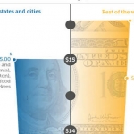
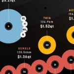
Randall Monroe’s Money Chart offer a definitive visualization of our cash-obsessed world. The massive chart cover the cost of some things, the amount people earn, government spending, taxes, business profits, utilities, war and others. This amazing chart effectively put the US dollar figures into perspective-from one dollar bill to one trillion dollars. The sums of money for each are organized in blocks for us to compare. See also Death and Taxes: US Federal Budget.

Specifications

Infographic Design
Data Visualization
Year Published  
2011
Designed by
Unknown
Associated Topics  
currency, monetary policy

The Money Mega Chart Infographic

Grade this Infographic
Your Grade
Rate Here
Visual Design
8.4
Informativeness
9.6
Understandability
8.6
Accuracy When Created
8.7
SHARE
8.8
Your Grade
8 ratings
You have rated this
Infogrades Staff
Infogrades is a curated directory of all types of info-graphic design. We handpicked the informative, entertaining and well-design to showcase, and let you grade them.

Last Updated:

25/04/2017